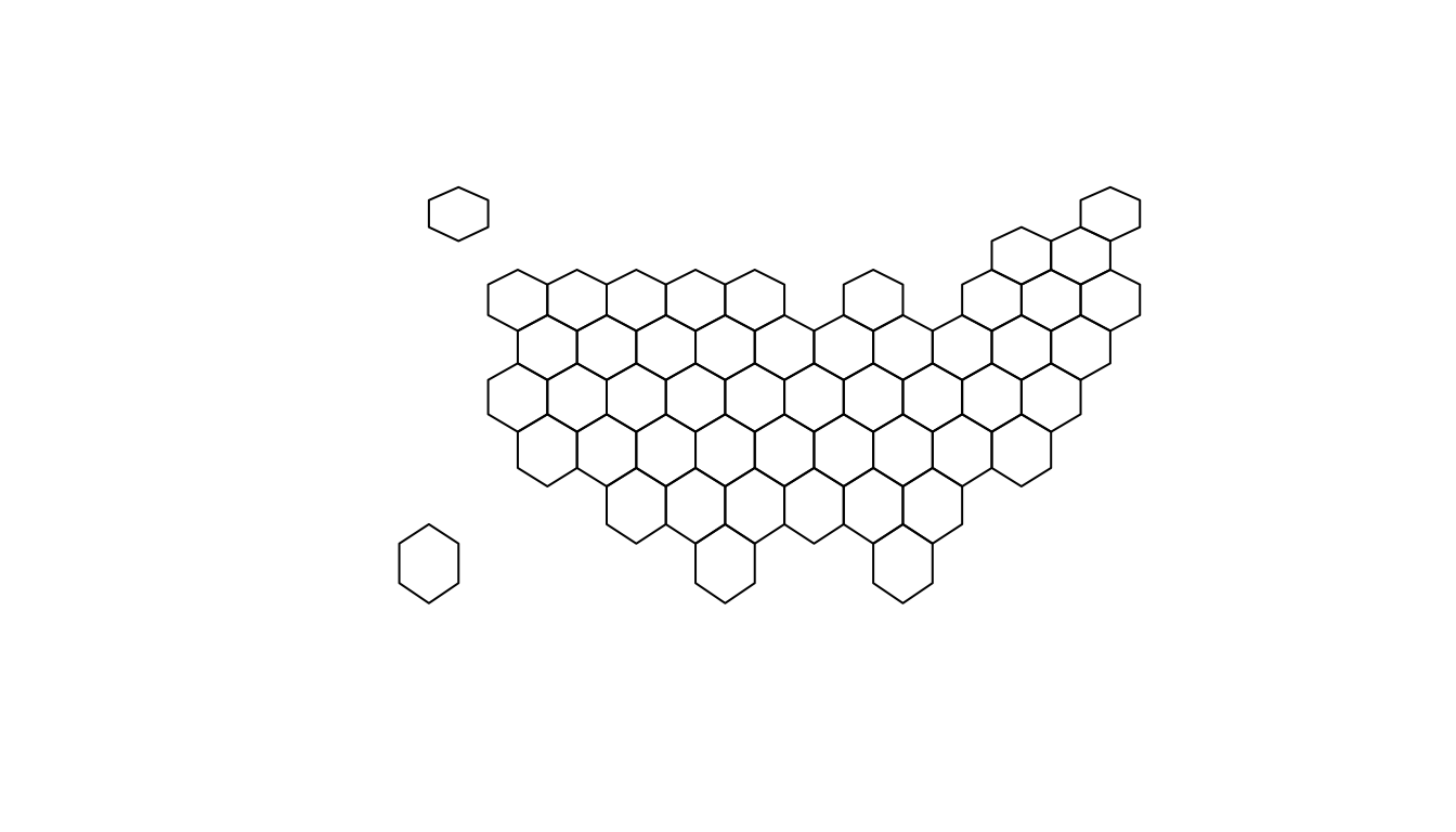
Basic hexbin map
The first step is to build a basic hexbin map of the US. Note that the gallery dedicates a whole section to this kind of map.
Hexagones boundaries are provided here. You have to download it at the geojson format and load it in R thanks to the geojson_read() function. You get a geospatial object that you can plot using the plot() function. This is widely explained in the background map section of the gallery.
# library
library(tidyverse)
library(geojsonio)
library(RColorBrewer)
library(rgdal)
# Download the Hexagones boundaries at geojson format here: https://team.carto.com/u/andrew/tables/andrew.us_states_hexgrid/public/map.
# Load this file. (Note: I stored in a folder called DATA)
spdf <- geojson_read("DATA/us_states_hexgrid.geojson.json", what = "sp")
# Bit of reformating
spdf@data = spdf@data %>%
mutate(google_name = gsub(" \\(United States\\)", "", google_name))
# Show it
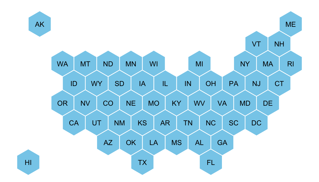
plot(spdf)ggplot2 and state name
It is totally doable to plot this geospatial object using ggplot2 and its geom_polygon() function, but we first need to fortify it using the broom package.
Moreover, the rgeos package is used here to compute the centroid of each region thanks to the gCentroid function.
# I need to 'fortify' the data to be able to show it with ggplot2 (we need a data frame format)
library(broom)
spdf@data = spdf@data %>% mutate(google_name = gsub(" \\(United States\\)", "", google_name))
spdf_fortified <- tidy(spdf, region = "google_name")

# Calculate the centroid of each hexagon to add the label:
library(rgeos)
centers <- cbind.data.frame(data.frame(gCentroid(spdf, byid=TRUE), id=spdf@data$iso3166_2))

# Now I can plot this shape easily as described before:
ggplot() +
  geom_polygon(data = spdf_fortified, aes( x = long, y = lat, group = group), fill="skyblue", color="white") +
  geom_text(data=centers, aes(x=x, y=y, label=id)) +
  theme_void() +
  coord_map()
Basic choropleth
Now you probably want to adjust the color of each hexagon, according to the value of a specific variable (we call it a choropleth map).
In this post I suggest to represent the number of wedding per thousand people. The data have been found here, and stored on a clean format here.
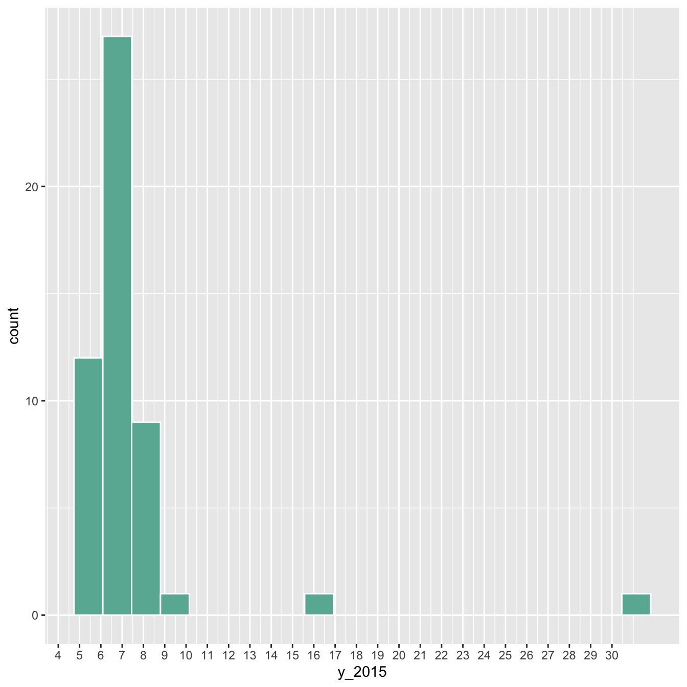
Let’s start by loading this information and represent its distribution:
# Load mariage data
data <- read.table("https://raw.githubusercontent.com/holtzy/R-graph-gallery/master/DATA/State_mariage_rate.csv", header=T, sep=",", na.strings="---")

# Distribution of the marriage rate?
data %>%
  ggplot( aes(x=y_2015)) +
    geom_histogram(bins=20, fill='#69b3a2', color='white') +
    scale_x_continuous(breaks = seq(1,30))
Most of the state have between 5 and 10 weddings per 1000 inhabitants, but there are 2 outliers with high values (16 and 32).
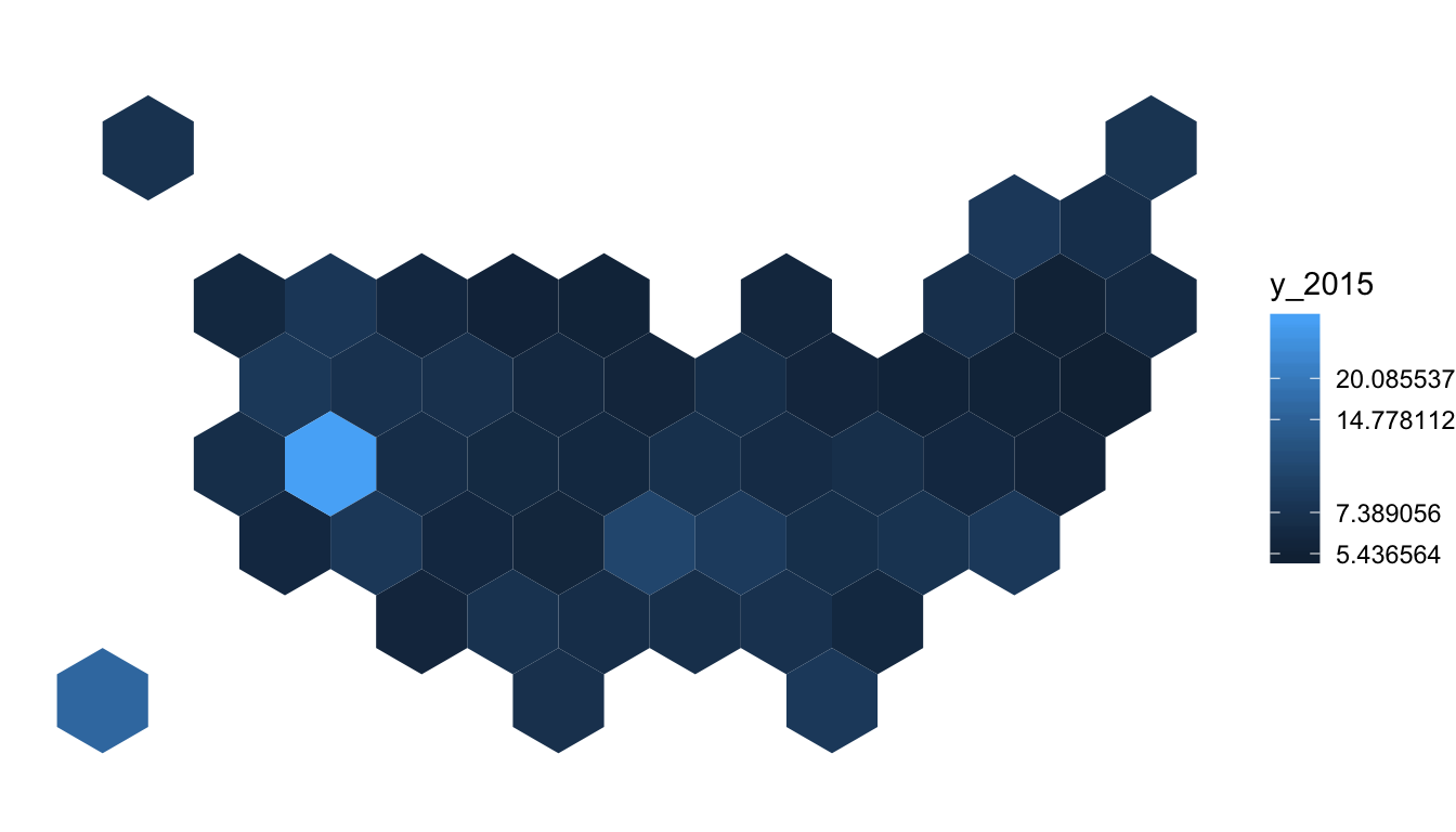
Let’s represent this information on a map. We have a column with the state id in both the geospatial and the numerical datasets. So we can merge both information and plot it.
Note the use of the trans = "log" option in the color scale to decrease the effect of the 2 outliers.
# Merge geospatial and numerical information
spdf_fortified <- spdf_fortified %>%
  left_join(. , data, by=c("id"="state"))

# Make a first chloropleth map
ggplot() +
  geom_polygon(data = spdf_fortified, aes(fill =  y_2015, x = long, y = lat, group = group)) +
  scale_fill_gradient(trans = "log") +
  theme_void() +
  coord_map()
Customized hexbin choropleth map
Here is a final version after applying a few customization:
- Use handmade binning for the colorscale with
scale_fill_manual - Use
viridisfor the color palette - Add custom legend and title
- Change background color
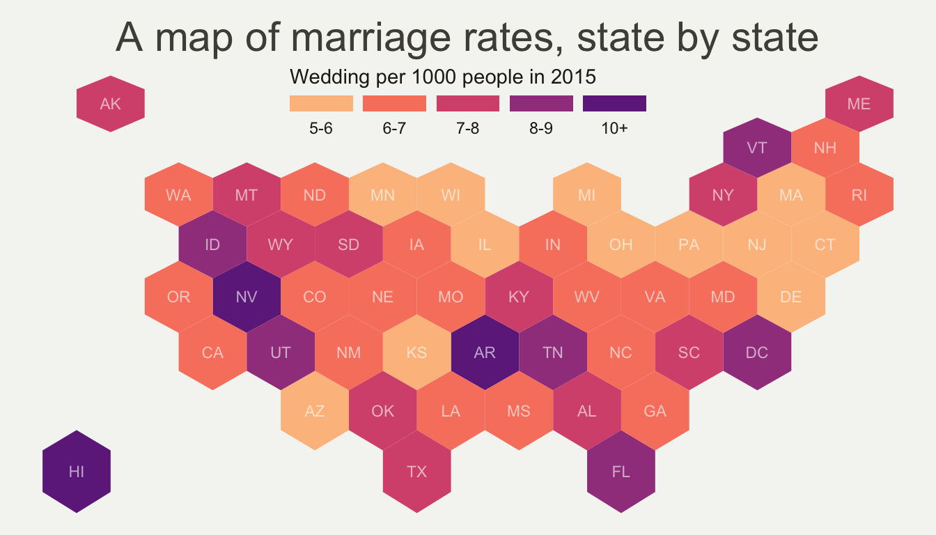
# Prepare binning
spdf_fortified$bin <- cut( spdf_fortified$y_2015 , breaks=c(seq(5,10), Inf), labels=c("5-6", "6-7", "7-8", "8-9", "9-10", "10+" ), include.lowest = TRUE )

# Prepare a color scale coming from the viridis color palette
library(viridis)
my_palette <- rev(magma(8))[c(-1,-8)]

# plot
ggplot() +
  geom_polygon(data = spdf_fortified, aes(fill = bin, x = long, y = lat, group = group) , size=0, alpha=0.9) +
  geom_text(data=centers, aes(x=x, y=y, label=id), color="white", size=3, alpha=0.6) +
  theme_void() +
  scale_fill_manual(
    values=my_palette,
    name="Wedding per 1000 people in 2015",
    guide = guide_legend( keyheight = unit(3, units = "mm"), keywidth=unit(12, units = "mm"), label.position = "bottom", title.position = 'top', nrow=1)
  ) +
  ggtitle( "A map of marriage rates, state by state" ) +
  theme(
    legend.position = c(0.5, 0.9),
    text = element_text(color = "#22211d"),
    plot.background = element_rect(fill = "#f5f5f2", color = NA),
    panel.background = element_rect(fill = "#f5f5f2", color = NA),
    legend.background = element_rect(fill = "#f5f5f2", color = NA),
    plot.title = element_text(size= 22, hjust=0.5, color = "#4e4d47", margin = margin(b = -0.1, t = 0.4, l = 2, unit = "cm")),
  )