3D charts


R allows to build three dimensional charts, mainly thanks to the rgl package. Even if 3D is often a bad practice, it can be useful in specific situation. This section provides several examples made in R.

Data visualization and 3d → Warning

Three dimensional objects are very popular but negatively affect the accuracy and speed at which one can interpret a graphic in most cases. In general, it is better to avoid them.

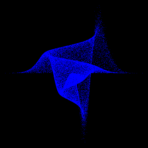
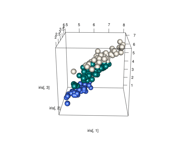
Basically, 3d scatterplots and surface plots 
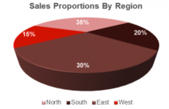
are the only tolerated exceptions. Please don't build 3d barplots or even worse, 3d pie charts.

Read more
a bad 3D pie chart

3d distorts reality. Source

3D charts with rgl

The rgl package is the best tool to work in 3D from R. Here is an illustration: a 3d scatterplot showing the relationship between 3 numerical variables.

Note that rgl automatically builds interactive charts. Zooming and rotating can indeed make the chart more insightful.

Source code


Trying zooming / rotating →


Surface plot with plotly

A surface plot shows the shape of a surface. It basically requires a grid coordinates with a numeric variable attributed to each position: its height.

Plotly allows to build that kind of chart in minutes, and gives the interactivity for free.

Source code


Trying zooming / rotating →


Other examples

Related chart types


Ggplot2
Animation
Interactivity
3D
Caveats
Data art