The
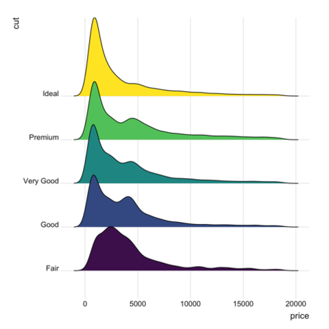
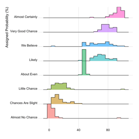
ggridges package.In term of code, a ridgeline chart is simply a set of many density plots. Thus, starting by learning the basics of density chart is probably a good idea.
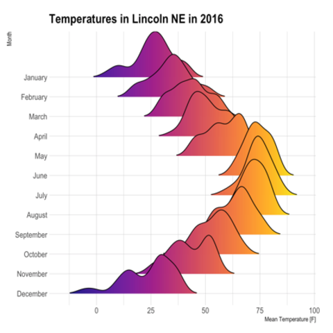
Welcome in the ridgeline chart section of the gallery. Sometimes called joyplot, this kind of chart allows to visualize the distribution of several numeric variables, as stated in data-to-viz.com. Here are several examples implemented using R and the ridgelines R package
ggridges package.In term of code, a ridgeline chart is simply a set of many density plots. Thus, starting by learning the basics of density chart is probably a good idea.
Related chart types