本文简单的介绍2种散点图添加边际图的方法。
一 载入数据,R包
使用经典数据集iris
library(ggplot2) #加载ggplot2包
library(ggExtra)
library(ggstatsplot)
data(iris)
head(iris)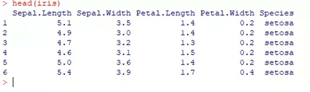
二 ggplot2 + ggExtra绘制边际散点图
使用ggplot2绘制散点图,然后利用ggExtra包的函数添加边际柱形图
2.1 绘制基础散点图
p1 <- ggplot(iris, aes(Sepal.Length, Sepal.Width)) +
 geom_point(color = "#00AFBB")
p1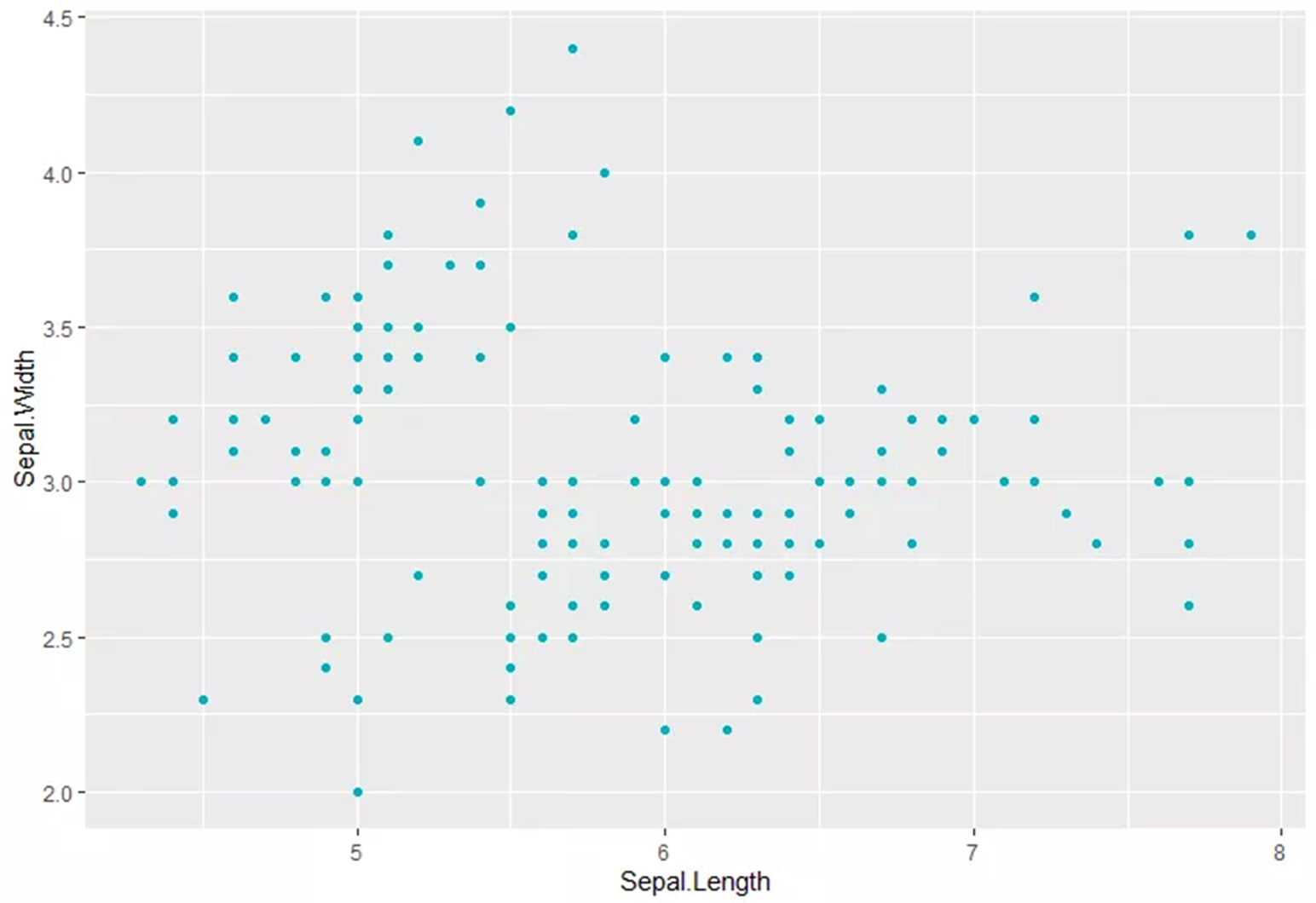
2.2 添加一点点细节
1)添加横轴,数轴线;
2)添加R2 和 P值
3)添加回归曲线
p2 <- ggplot(iris, aes(Sepal.Length, Sepal.Width)) +
 geom_point(color = "#00AFBB") +
 geom_smooth(method="lm", se=T) +
 geom_hline(yintercept = 3, linetype = "dashed", color = "blue") +
 geom_vline(xintercept = 6, linetype = "dashed", color = "red") +
 annotate("text", x=4.5, y=4.25, parse=TRUE,

          label="r^2 == 0.0138 * ' p-value = 0.1529' ")

p2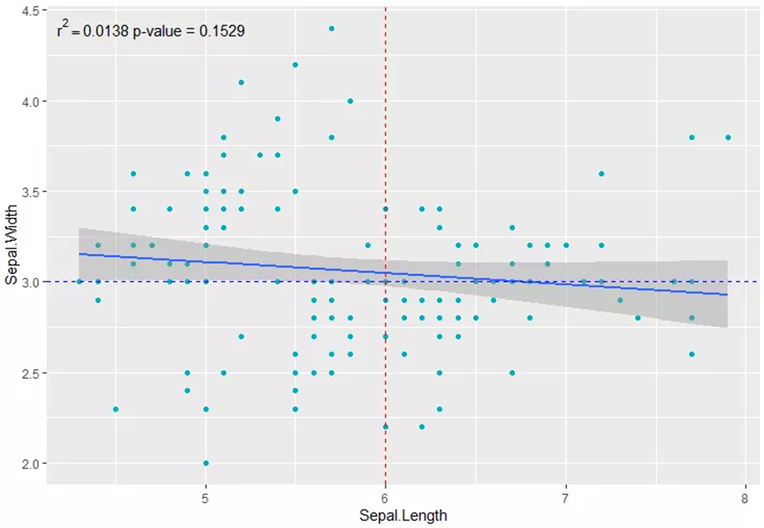
既然是ggplot2绘制的,那更多细节还不是按照需求直接加就行嘛。
2.3 添加边际条形图
使用ggMarginal添加, Type 可选参数 histogram, density 和 boxplot.
ggMarginal(p2, type = "histogram", fill = "#00AFBB")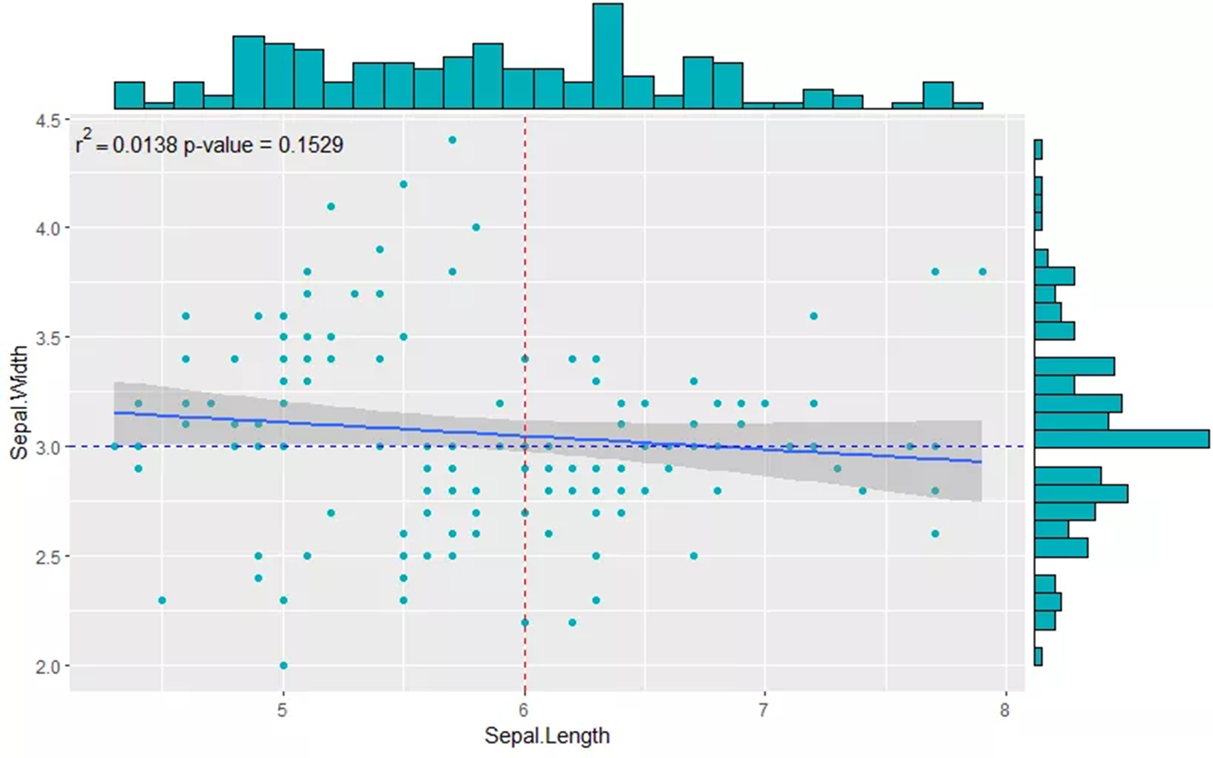
三 ggstatsplot绘制边际散点图
直接使用ggstatsplot包的ggscatterstats函数绘制
library(ggstatsplot)

ggscatterstats(

 data = iris,
 x = Sepal.Length,
 y = Sepal.Width,
 xlab = "Sepal Length",
 ylab = "Sepal Width",
 marginal = TRUE,
 marginal.type = "densigram",
 margins = "both",
 xfill = "blue", # 分别设置颜色
 yfill = "#009E73",
 title = "Relationship between Sepal Length and Sepal Width",
 messages = FALSE
)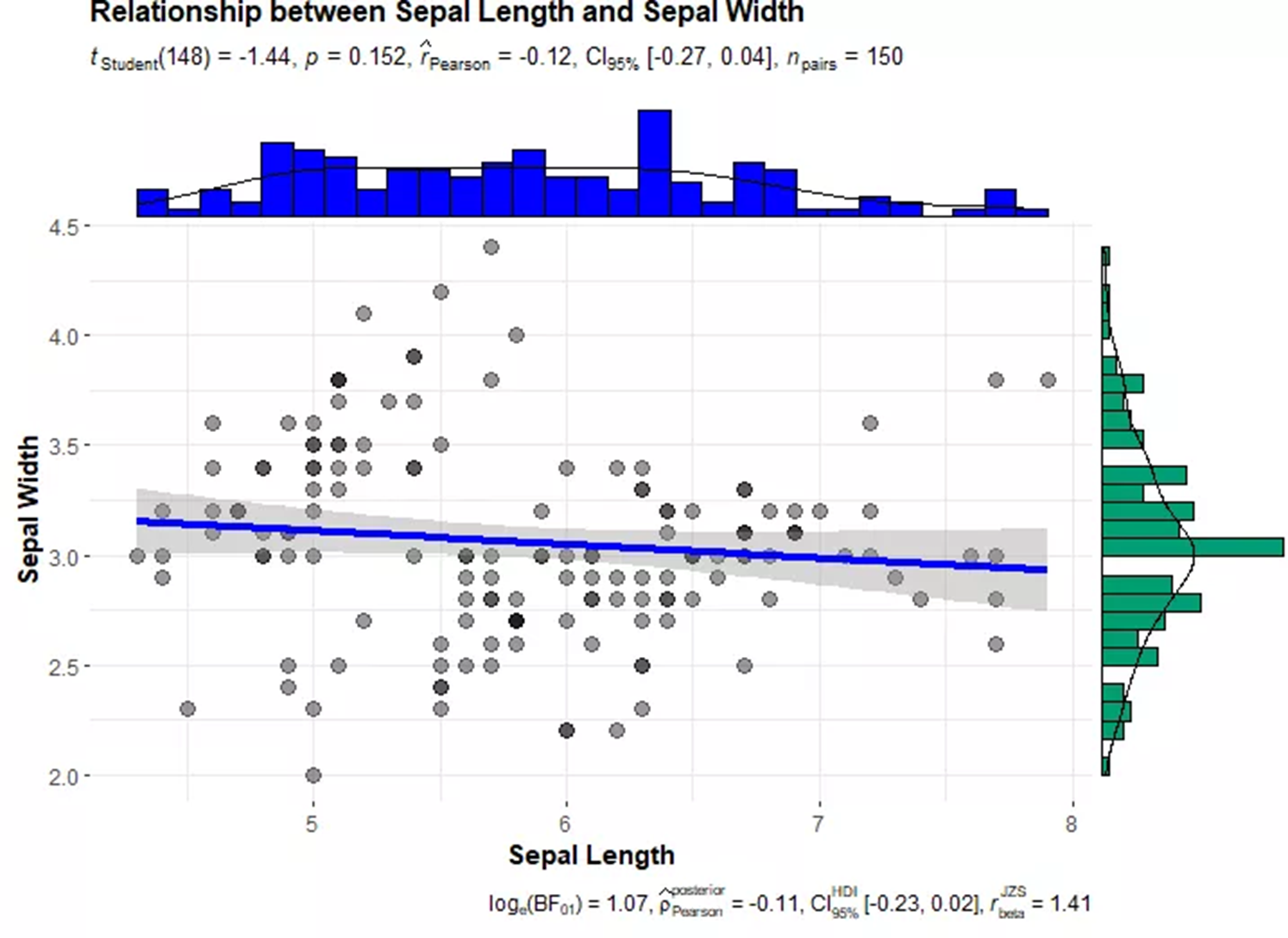
其中marginal.type可选 histograms,boxplots,density,violin,densigram (density + histogram);可自行尝试效果。
OK,文献中常见的带边际图的散点图就绘制好了!更多参数设置详见参考资料。
参考资料:
https://www.r-graph-gallery.com/277-marginal-histogram-for-ggplot2
https://indrajeetpatil.github.io/ggstatsplot/