小提琴图其实是箱线图与核密度图的结合,箱线图展示了分位数的位置,小提琴图则展示了任意位置的密度,通过小提琴图可以知道哪些位置的密度较高。
不同图形可以反映数据不同的方面,这时候选取哪个图展示数据就需要斟酌一份,当然也可以结合起来。
加载R包
library(pacman)

# p_install_gh("psyteachr/introdataviz") #github安装R包

# devtools::install_github("psyteachr/introdataviz")

library(introdataviz)

library(tidyverse)
ggplot2绘制分裂小提琴图
colours <- c("#FF0000","#00A08A")

ggplot(ldt_long, aes(x = condition, y = rt, fill = language)) +

introdataviz::geom_split_violin(alpha = .4) +

geom_boxplot(width = .2, alpha = .6, show.legend = FALSE) +

stat_summary(fun.data = "mean_se", geom = "pointrange", show.legend = F,

position = position_dodge(.175)) +

scale_x_discrete(name = "Condition", labels = c("Non-word", "Word")) +

scale_y_continuous(name = "Reaction time (ms)") +

scale_fill_manual(values = colours, name = "Language group") +

theme_minimal()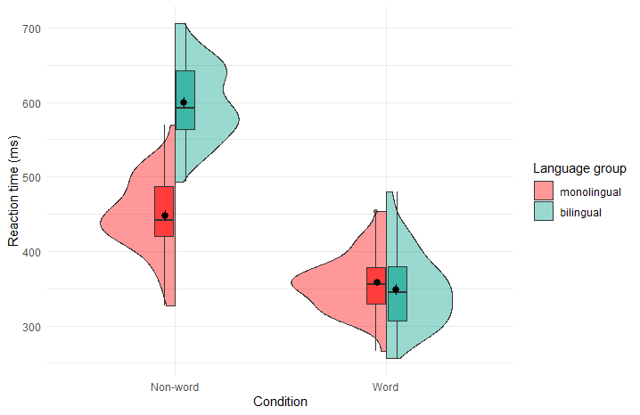
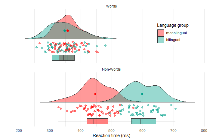
ggplot2绘制云雨图
rain_height <- .1

ggplot(ldt_long, aes(x = "", y = rt, fill = language)) +

introdataviz::geom_flat_violin(trim=FALSE, alpha = 0.4,

position = position_nudge(x = rain_height+.05)) +

geom_point(aes(colour = language), size = 2, alpha = .5, show.legend = FALSE,

position = position_jitter(width = rain_height, height = 0)) +

geom_boxplot(width = rain_height, alpha = 0.5, show.legend = FALSE,

outlier.shape = NA,

position = position_nudge(x = -rain_height*2)) +

stat_summary(fun.data = mean_se, mapping = aes(color = language), show.legend = FALSE,

position = position_nudge(x = rain_height * 3)) +

scale_x_discrete(name = "", expand = c(rain_height*3, 0, 0, 0.7)) +

scale_y_continuous(name = "Reaction time (ms)",

breaks = seq(200, 800, 100),

limits = c(200, 800)) +

coord_flip() +

facet_wrap(~factor(condition,

levels = c("word", "nonword"),

labels = c("Words", "Non-Words")),

nrow = 2) +

scale_fill_manual(values = colours, name = "Language group") +

scale_colour_manual(values = colours) +

theme_minimal() +

theme(panel.grid.major.y = element_blank(),

legend.position = c(0.8, 0.8),

legend.background = element_rect(fill = "white", color = "white")
)
进哥的shiny小程序里面可以很便捷的绘制分裂小提琴图和云雨图哦,感兴趣可以试试看
希望可以在解释下每种图在什么情况下使用,数据格式是什么样的
谢谢建议,后续补充上去